One thing is true for just about every site on the internet: the homepage gets the most traffic.
That’s partially based on people’s browsing habits and site design, as anyone who lands on any page on your site can usually easily navigate back to your homepage with just one click.
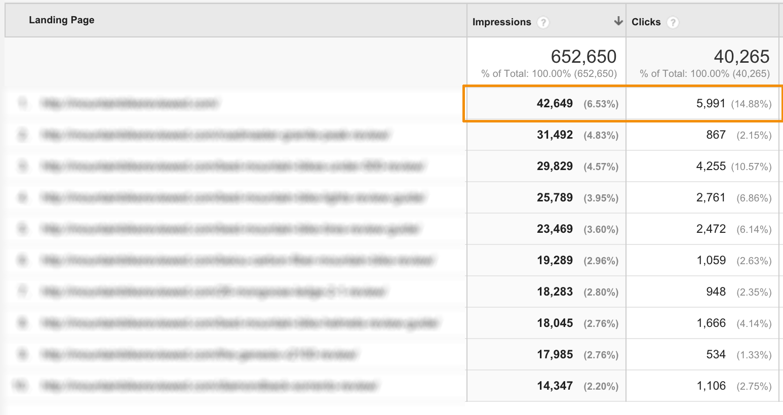
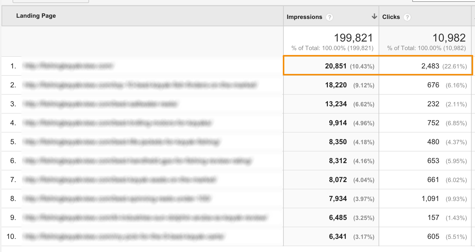
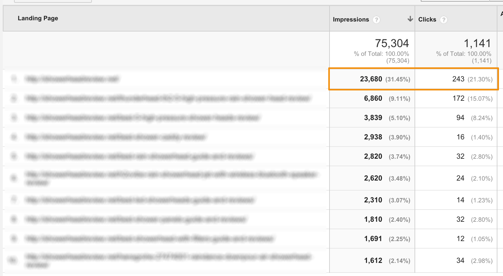
Let me show you example from 3 of my Amazon niche sites for a clearer picture:
[sociallocker id=”1786″]
[/sociallocker]
The first site is relatively older, the second one I started around 7 months ago, and the 3rd site I started a couple months ago.
All of these sites have one thing in common: Homepage gets most traffic.
Why is that?
It’s partially due to the way that search engines return results to favor home pages for big keywords. Also, when we build niche site, we target the main keyword on homepage. When building links, we priorities homepage over dozens of contents we publish on the same site.
So if your niche website’s homepage is going to be your most visited page anyhow, why not take advantage of that?
That’s where conversion optimized niche site homepage come in. With a well-designed homepage that leads to amazon sales, you will see much higher click rate from your site to Amazon and a much more conversion rate at Amazon.
[toc]
How To Write A Niche Site Homepage Content
I discussed niche site contents earlier. Today, I especially want to talk about niche site homepage.
On my previous article, I focused the following points that you need to consider when writing:
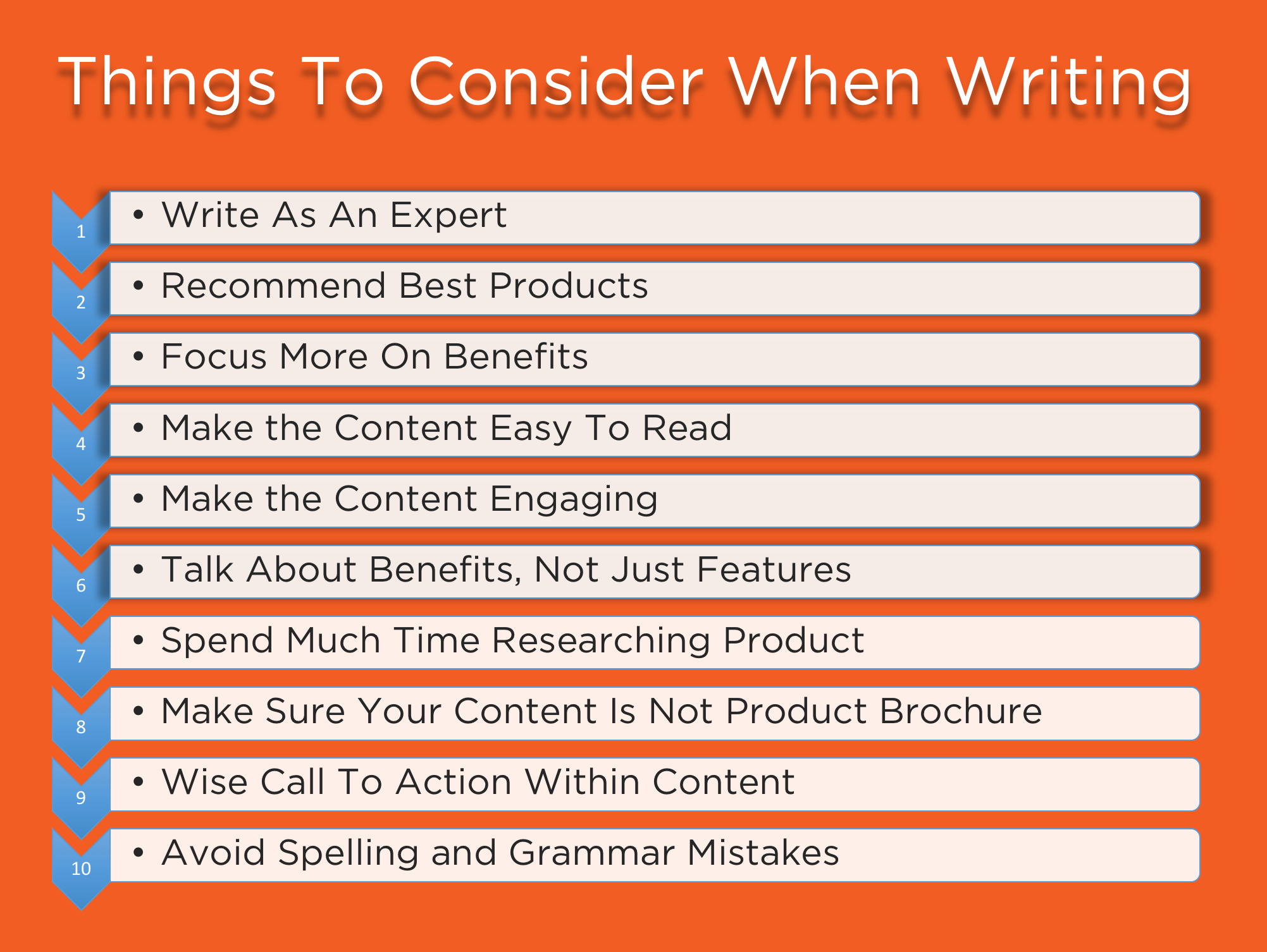
Do you follow the same blueprint as for the general contents?
Here’s how I do it. This is the exact guideline I follow to get maximum sales with the traffic received.
1. Write High-Quality Engaging Contents
Just like on every other page on your niche site, it all starts with content. People visit your site to find information but they will convert more if you entertain them while educating the lot.
If you want your content to convert visitors into buyers, you need to write with an expert’s voice and cadence. You need to write content that’s original and high quality from a spelling and grammatical perspective.
Also, you need to put in the time to do your research, and learn enough about the material you are writing to have something interesting to say.
And you need to practice writing copy that doesn’t look like a boring copy. There’s a lot to learn about content that converts, but that’s what every aspect of your niche site will be based on, homepage included.
2. Provide Exact Information They Are Looking For
On average, a visitor to your site will remain for less than a minute on your website before moving on.
All you have is a minute to get your reader’s attention and keep them in and send them to Amazon to buy the particular product. The best way to do that is by providing genuinely helpful information.
If you don’t have the answers they are looking for, and don’t make them readily available, they will find those answers somewhere else.
As far as your niche site’s homepage is concerned, focus on creating content that provides well-rounded and helpful information that answers questions holistically. You want each reader that lands on your homepage to feel that they have found everything they need, and don’t need to bounce to another site to find the details they want.
For niche site owners, that means putting all of the relevant information about your chosen niche product or products in one place in a manner that is truly accessible and helpful for your visitors.
Sounds like an impossibly ambitious task?
Don’t worry, in the rest of this guide, I’m going to share some techniques that you can employ to do all of that and more with ease.
3. Adding Comparison Table Can Increase Conversion Up to 300%!
Niche site experts who see real commission numbers can all agree that comparison tables sell. Dom Well from HumanProofDesigns increased one of his Amazon niche site conversion rate upto 300% adding a simple comparison table.
A well-constructed comparison table will not only help you link to the products you are hoping your visitors buy, they will give your readers a graphically friendly and easy to consume content.
Once you’ve laid out all of the right information in the right way, the product will sell itself.
On your niche site’s homepage, consider including a comparison table with multiple of the best selling products in your niche (more on that later). Then, link directly to each product within your table to make it even easier to point your visitors in a direction that will lead to a commission in your pocket.
Shashank from ShashankGupta.net suggests comparing the main products in details on his step by step Amazon affiliate guide, as he said, he experienced a huge increase in conversion.
Make sure your comparison table only includes relevant information, and doesn’t take up so much space that your visitors spend more than a few moments judging your selected niche products against each other.
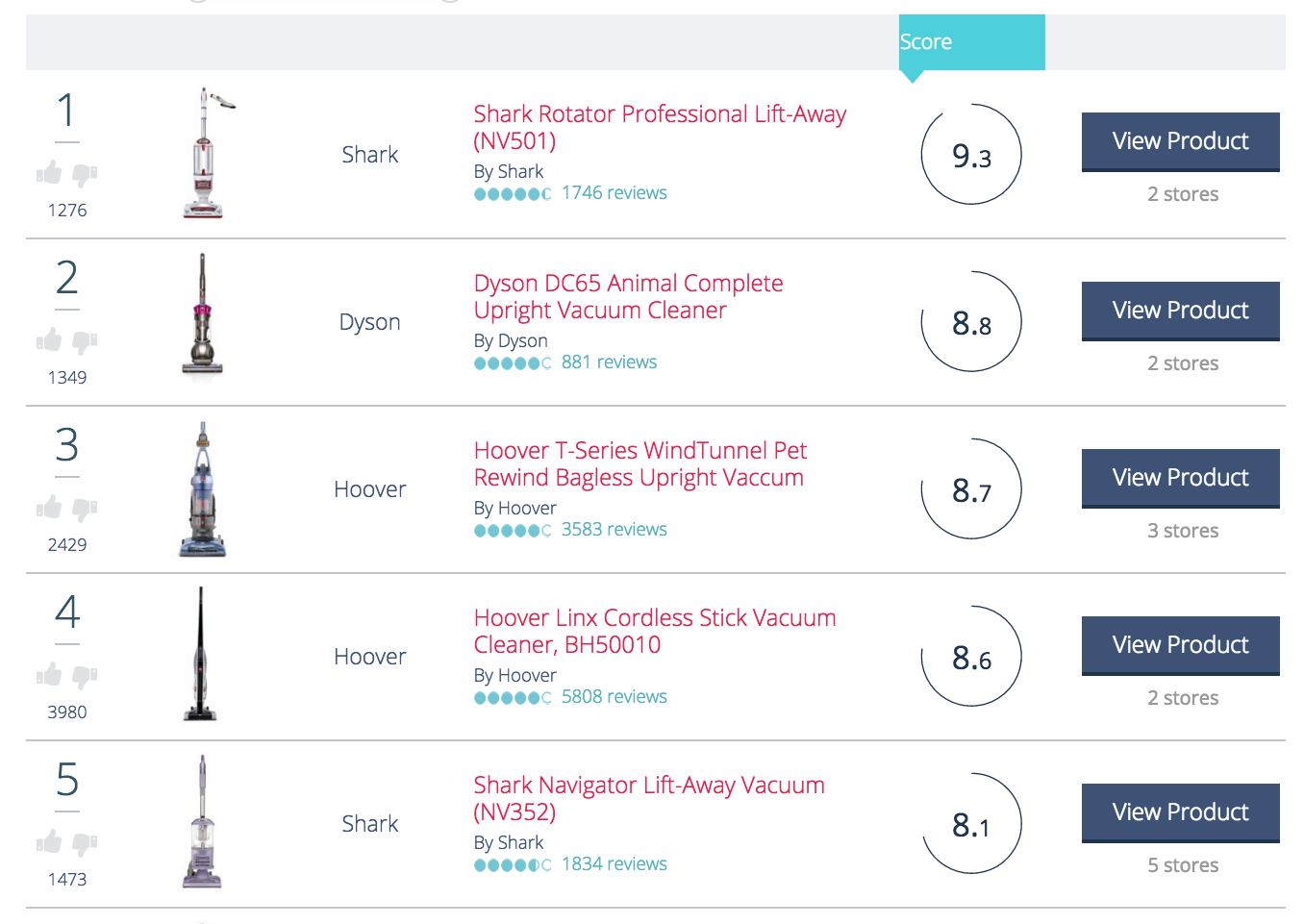
Here are some example comparison table you can create for you niche site:
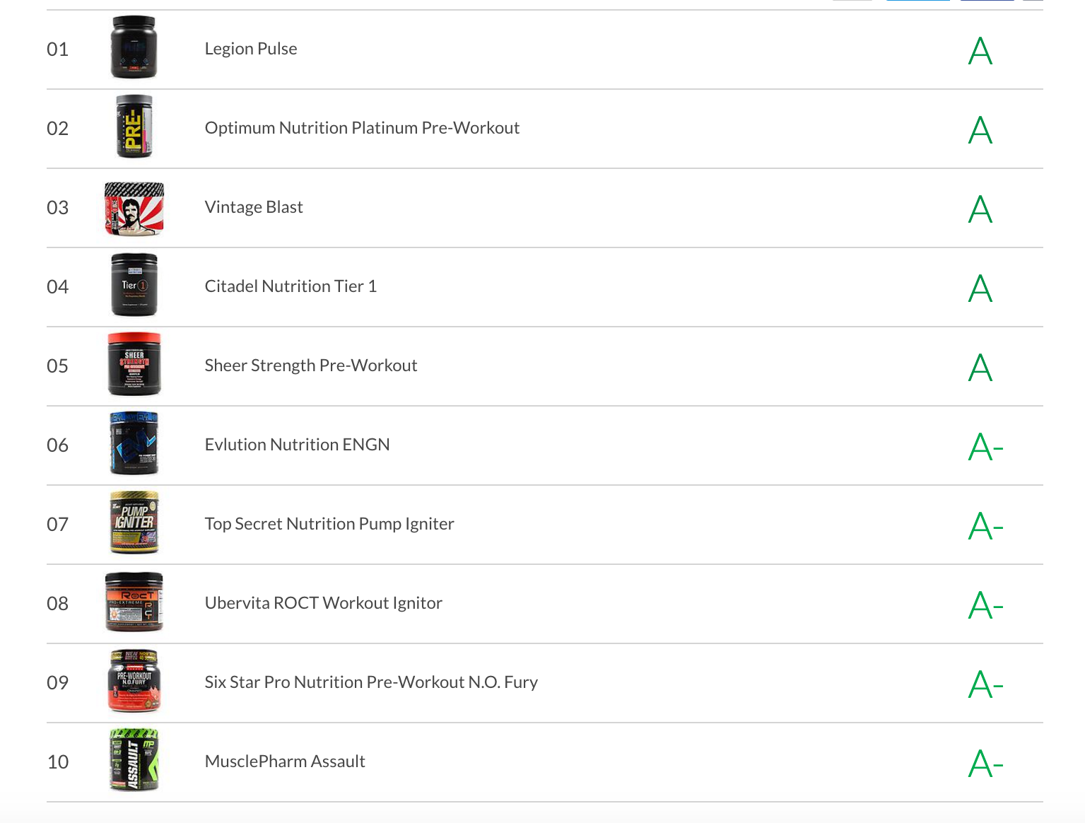
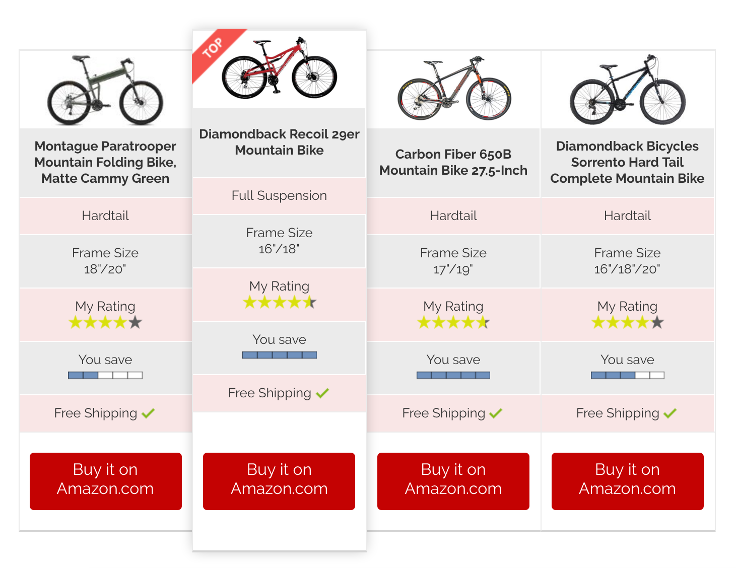
You will find numerous comparison table creating plugin in Codecanyon. However, I personally prefer GoPricing, the best comparison table creator available on the market. The last comparison table shown above is created using this plugin.
4. Write Detailed Product Reviews On Homepage and Publish A Separate Detailed Review
For all of the top products in your niche, you should include a detailed product review directly on your homepage. When product reviews follow a well-crafted comparison table, they give visitors another way to digest even more information about your niche items.
Depending on how many top selling products you are targeting, product reviews can be anywhere from 300-500 words in homepage. Just make sure that they are detailed and provide your visitors with real value.
88% of consumers trust online product reviews as much as they trust a personal recommendation, so this is a powerful place for you to push visitors in the direction of whichever niche product you are hoping to convert for.
5. Mention Product Pros and Cons / Feature Highlights
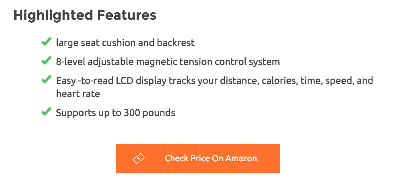
Within your product reviews, make sure to mention the “pros” and “cons” of each item you list. Also, mention feature highlights of the products so readers can check shortly, what they are really going to get on that particular product.
Comparing things with pros and cons is one of the first ways that many people learn to make up their mind about any decision, and listing pros and cons explicitly in your product reviews will give you the chance to afford your readers one more way to compare products directly.
Many readers will skim through a review looking for pros and cons, so if you choose to leave these out you are bound to disappoint potentially converting visitors.Make sure you have the “Much Detailed Review” of that product available in the site as a separate post.
Make sure you have the “Much Detailed Review” of that product available in the site as a separate post.
6. Add a Clear Call To Action
Call to action matters!
If you want your niche site homepage to convert, you need to make it easy for visitors to end up exactly where you want them to be, which for niche site owners means funneling readers towards the Amazon product link, where they can make the purchase.
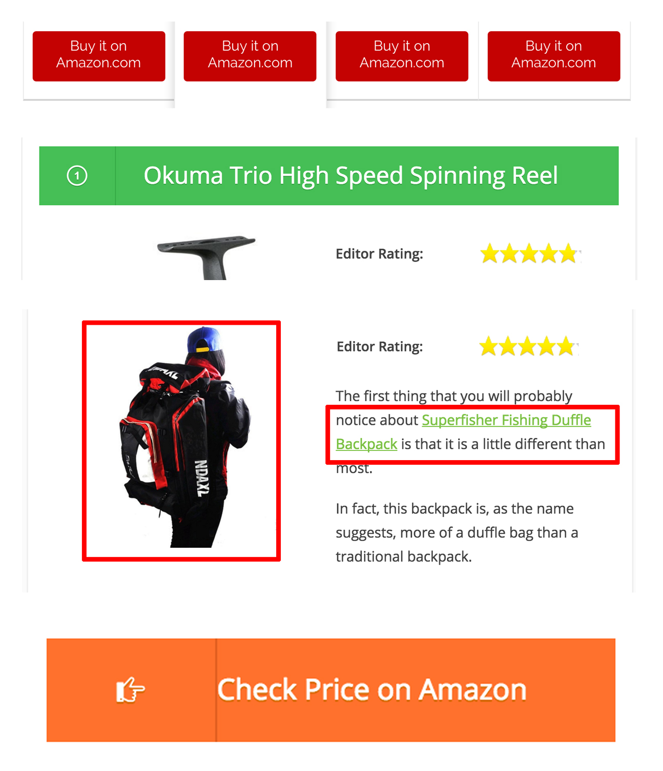
Good home pages that lead to conversions will usually have multiple “calls to action” throughout, beckoning people to purchase the niche items you are reviewing.
If you’re not landing many conversion from your home page, experiment with the wording and format of your call to action: some case studies show that changing a single word can boost click rates on call to action buttons by 90% or more.
For me, I use call to action button in:
- Comparison table
- Product name subhead
- First product name mention
- Product image
- Price Call To Action
7. Recommend Only Best Products
 Chances are, your visitors have done some research on your niche products before viewing your site, and have already gathered some information from various means.
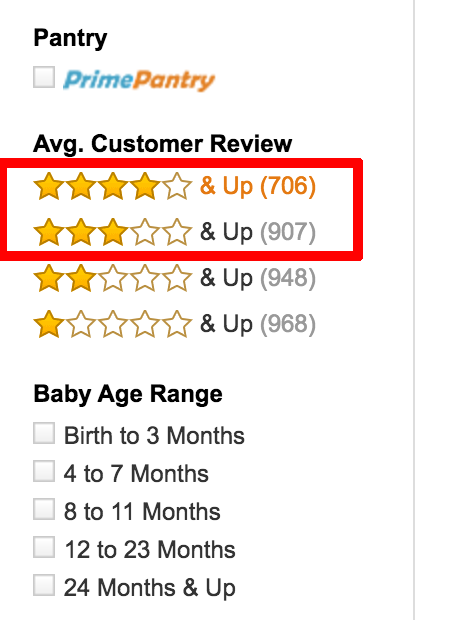
That means, unless you want to stand out for recommending bad products, you should only throw your weight behind niche items that you have full confidence in, and which have good reviews on Amazon and in other places.
Pushing products that most people have reviewed negatively is a risky move, and will probably serve to drive off your visitors rather than produce conversions.
Before putting any product in my best list, I always check it with related authority sites, top ranked site on Google in that particular search term, and Amazon reviews.
8. Do Proper Content Formatting and Design For Better Conversion
Depending on who you ask, the formatting of your content is either as important or more important than your content itself. If you want to see your niche site produce higher conversion rates, you will need to be sure that all of your content is optimized for web viewers to digest.
That means you content needs to be scannable, media rich, and peppered with your calls to action. If you content doesn’t look appealing within a few seconds, your readers will move somewhere.
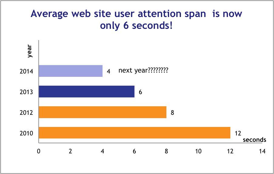
For a single example, putting your most important “call to action” button on its own line, rather than embedding it in your text, can immediately double your click through rates.
Case studies abound, Gael and Mark from AuthorityHacker mentioned 9275 times as much traffic on specific pages just by reformatting them.
If you want to create a niche homepage that leads to conversions, formatting your content well should be a top priority.
I use the following content formatting points before hitting the Publish button:
- Clear Headings
- Short Paragraphs
- Bullet points
- Media (Images, Graphs, Video Snippets)
- Highlighted text (Strong, Emphatic, Anchor Text)
For better content design, I use Thrive Content Builder plugin in all of my niche sites.
How To Research Best Products
All of the information above will help you create niche site home pages that sell products, and lead to conversions which pay out in commissions.
But the question remains, “Which products should you choose to feature on your homepage?”
While a good niche site can review dozens of products, your home page should only feature 5-10 items in your niche.
Here’s how to find the best ones to feature:
1. Check Amazon Best Sellers
Begin by doing a quick keyword search on Amazon for products in your niche, and sort your results by the best selling products. Make sure that you are only looking at products in your niche by narrowing down your results by category.
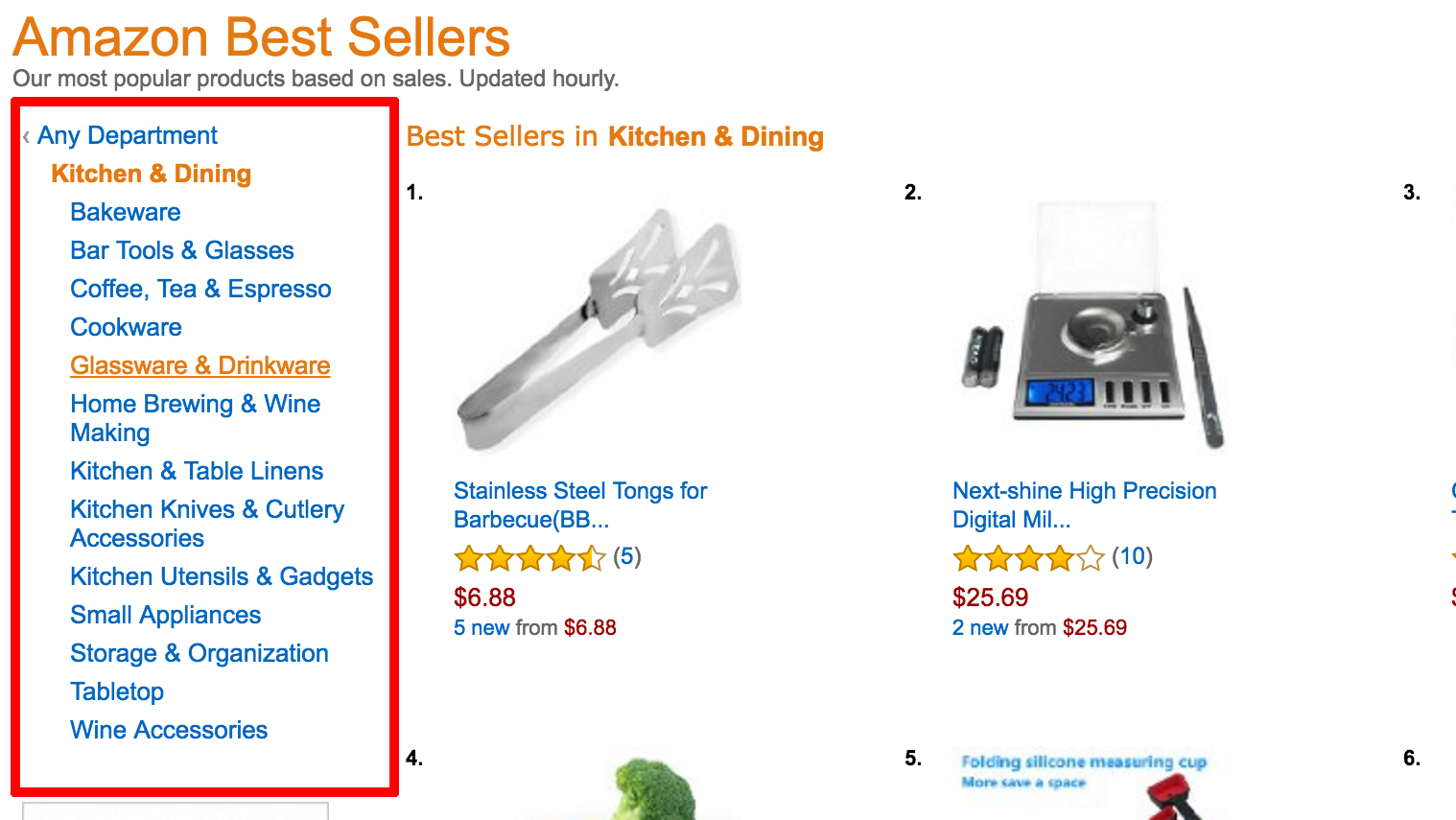
2. Select Top 5 or Top 10 Best Products
Once you’ve sorted your search by top sellers, go ahead and select the top 5-10 products that come up. Note the products selected.
3. Check Industry Authority Site For Product Recommendation
After selecting your products, do some research and see what industry experts are saying about each product. Depending on your niche, top authority sites (like home products – TheSweetHome.com, for technological products, TheWireCutter.com) can be a good place to start.
See if any of the best selling products you’ve narrowed down have been red-flagged by other authority sites.
4. Check Customer Reviews on Amazon and Highlight Product Benefits
Once you’ve found 5/10 top selling products that don’t have any negative reviews on other authority sites, dig through a few Amazon customer reviews to find out more about each product. From there, it’s easy to finalize a list of what to showcase on your homepage.
Homepage Content Format
I write my niche site contents for 3000 to 4000 words, and I build them following this content format:
1. Introduction To The Product Type (E.G – Keyword) – 100 to 150 Words
2. How To Choose [Keyword] (400 to 500 Words In Total Under 3 To 4 Subheads)A. Things To Consider:
- Things To Consider 1
- Things To Consider 2
- Things To Consider 3
- Things To Consider 4
- Other Considerations Long Sentenced Bullet Point
Note: Try to cover most of the considerations on these points. Implement bullet points under each consideration if possible.
3. Recommended Product Reviews (200-250 word review for each product, only unique selling propositions of each product – under several subhead. Also focus the Highlighted Features under the short review)
- Individual product reviews 1
- Individual product reviews 3
- Individual product reviews 3
- The list goes on…
4. Final Verdict (100 to 120 Words)
This is my personal content format, however, you can check the successful niche sites from Google, and make your own content format after analyzing a couple. To me, the above format is working great.
Don’t Stop There!
Of course, your homepage isn’t the only place to get conversions on your niche site, but it can be one of the most powerful when utilized correctly. Start with the tips above and experiment on your own, and watch your niche site’s home page become the best converting page on your site.


Hello brother Al-Amin,
From the knowledge you have shared with us taught me that- “success doesn’t come to you; you go to it”. Finally thanks for sharing the exclusive resource.
Thanks, Masud. I’m glad you liked the article 🙂
Dear, Al-Amin Brother, I have learned new things about Home Page Content Proper Guideline, that’s way, I read this article up to bottom, really clear concept and Good Presentation with an example like screen short and resources which help for easy understanding. Thanks for your Content.
I’m glad that you learned something new from this article, Shihab! 🙂
Thanks Al-Amin vi 🙂
You are welcome, Anik 🙂
Actually, I’m waiting relevant this post. How I can engage the traffic on the Homepage. Excellent post! Really helped me. I’have one question. if you have time to answer. Which plugin will best for make a comparison table? Please suggest free or paid method.
Thanks for your hard work 🙂
Hi AlAmin, such a huge and detailed post. When creating a niche site, should I put a static front page on home? Because thats the only way to make it a targeted page. What about blog posts on home.
Al-Amin Vai,
Thank you so much for this great article. It will help us all.
Hi AlAmin,
Always love your detailed writing.
I got lots of answer about homepage content from this.
Would love to see some articles on backlinks as well.
Regards
Thank you. What type of homepage would you suggest for a site that does not have a main keyword and is going for the authority site route?
thanks Al-Amin
it was a geat help as i was confused how to put the homepage in my nichesite btween latest or a great homepage
Thanks, bro. I get lot of important information from this article.
Thanks for share this post.I Think this post is best for a nicsh site select.
Thanks a lot for sharing this kind of amazing guide infect very details guide,
I am facing one problem with my homepage that my tables of contact is not being show in the homepage. I am using table if contents plugin can you answer this question or recommend any plugin?
Thanks
Regards
I have the same problem with the TOC wordpress plugin.
Did you find a solution ?
Thanks AL-AMIN KABIR, I have a small question, Where should I put comparision table in my homepage article?
Thanks for this great post. Excellent Detailed post.
Thanks, Elkhiyati!
I hope you are doing well. I’m still waiting for your e-book, btw 🙂
Your posting is detail and useful for newbies (including me). By reading your article, I can re-format my homepage, it looks terrible.
Thanks,
Hi Al-Amin,
I just came across this post and I must say, great job!
I have been trying to think of a better way to display my homepage, and you have just nailed it.
Thankyou for sharing your ideas.
Glen
Hey, brother
Thanks for sharing this awesome information with us.
One mistake i made by choosing tough niche for my amazon niche site and i even can’t find more long tail keywords under 30 competition.
What should i do? I need your suggestion
Thanks,
Aakash Patel
Brother
Your post is very nice.I liked it a lot.We expect this type of posts more.I got many things from your post.carry on bro
I agree about the comparison tables. I’ve done some testing on small niche sites and the comparisons really do help conversions to improve.
Hey Al-Amin,
Yet another ravishing post. Really loved it!!
You were spot on with conversion techniques. Without conversion, an affiliate site is as good as a dead site. Although Amazon makes the final conversion easier, we need to send maximum traffic to Amazon and that’s where your tips would play such a crucial role.
I am usually more into Adsense sites than amazon sites and this is where I feel Adsense sites are better than amazon ones, no worries of conversion.
Before anyone says, adsense is not a good source of income, let me tell him I am making $10k+/month through Adsense niche sites. So, what am saying is from my experience. 🙂
Coming back to this article, it was really a good one. Keep up the good work mate.
I understand you are too busy these days, still I Would love to get a reply to my mail I sent a couple of days back. 🙂
Cheers.
Sarvesh
NicheDesire.com
hey thanks for the awesome guide. 🙂
btw can u please tell me what are/is the plugin name of all three comparison table?
Hello there, again a very helpful article. Thank you for sharing this information with us.
Thank for share, i will try use for my site !can you outline how to seach good writer for home page?
Hi,
Thanks for the post. Well written and to the point.
You mentioned gopricing plugin, which I have have bought per your recommendation.
Do you know what plugin was used to create the other two tables you showed in your images? I am particularly interested in trying them out too.
Regards
Hello Al-Amin Bro,
Thanks for the fantastic guideline to write niche site homepage content. Your guide will surely help me to strat my next nice site project with an effective homepage content.
Hi Kabir,
You’ve done a great done on this topic, and I have to say a special thank for treating the subject in detail. Writing a niche site Homepage content that converts is not easy. To start with, on this particular post, I can see you added a table of content. Is there a special way of doing that? I am yet to figure out how to apply that on content. Having said that, let me quickly run through some of the salient points of this piece.
1. High-quality, engaging content keeps people coming back to your site. It also keeps new visitors longer on your site.
2. Providing the right information makes your site a reference site where a lot of people come to get what they are seeking for on a particular subject.
3. Comparison table increases profit, if done the right way.
4. Detailed product review leads to more trust
5. Adding Pros and Cons makes your review more unbiased
6. Recommending only best products reduces the risk of rejection
7. A proper content formating increases conversion
8. A clear call to actions gives direction to your visitors on what to do.ETC
Qulaity content is non-negotiable. Anyone who wishes to succeed as an affiliate marketer must be ready to provide quality. If you can’t do it yourself, hire freelancers to do it for you.
The number reason people visit your site is to get information. If you can provide that, then you can be sure they will keep coming back. They will also trust you the more for being an authority in your chosen field.
The use of Pros and Cons ensures that you are not seen as taking sides with anyone. If you concentrate only on Pros, your readers will easily conclude you are presenting only the good side in order to increase sales. If on the other hand you include only the cons, you will be seen as trying to take revenge on a wrong done to you. They could even feel you are being sponsored to destroy another person’s name.
The products you recommend are import. If anything goes wrong, your readers will easily blame you for misleading them into buying poor quality products. But when things go well, they are happy with you; this eventually increases trust.
Readers and visitors always want to be told what to do. That is the more reason why you must add a clear call-to-action button on your site. But, I must say that I never had this understanding that adding the button on its own line increases conversion. I will try and implement it on my Affiliate Reviews Center.
I did a new post recently on the Highest paying affiliate niches to promote, and within a few hours, it was already receiving a lot of visits and comments. I guess it was the right application of the principles you have highlighted in this post that lead to that high engagement on that write up. I am still learning some other ways to improve my affiliate marketing skills and then earn more revenue in the long run.
Thanks once again, Kabir, for a great job, and for allowing contribute on your site. Do have a lovely day.